Getting Sassy with WordPress
(Follow along at http://taupecat.github.io/sassywp)
Tweet it!
I'm getting Sassy at #WCNYC!
Tracy Rotton
- @taupecat
- Lead Web Developer for RP3 Agency
- Front-end developer for 20 years (seriously)
- WordPress core contributor
What Are We Talking About?
- What is Sass?
- Pros & cons.
- How can you make Sass part
of your WordPress theming life?
What Is Sass?
- CSS Preprocessor
- Introduces programming
concepts into CSS authoring. - Makes CSS authoring easier,
faster, and more organized.
Why I Love Sass
- Can do lots of cool stuff
- Strong community
- "Blessed" by WordPress core
- _s (Underscores)
Why Sass Is Awesome

Nesting
.sidebar {
  border-left: 1px solid #262626;
  padding-left: 20px;

  aside {
    margin-bottom: 20px;

    a {
      color: #ffe44b;

      &:hover, &:active, &:focus {
        color: #e10000;
      }
    }
  }
}
Nesting
.sidebar {
  border-left: 1px solid #262626;
  padding-left: 20px;
}

.sidebar aside {
  margin-bottom: 20px;
}

.sidebar aside a {
  color: #ffe44b;
}

.sidebar aside a:hover,
.sidebar aside a:active,
.sidebar aside a:focus {
  color: #e10000;
}
Variables
- Almost anything can be a variable.
- Great for defining colors and font stacks.
Variables
$color-primary: #002366;
$font-header: Roboto, "Helvetica Neue", Arial, sans-serif;

body {
  background-color: $color-primary;
}

h1, h2, h3 {
  font-family: $font-header;
}

.subtitle {
  font-family: $font-header;
}
Variables
body {
  background-color: #002366;
}

h1, h2, h3 {
  font-family: Roboto, "Helvetica Neue", Arial, sans-serif;
}

.subtitle {
  font-family: Roboto, "Helvetica Neue", Arial, sans-serif;
}
@extend & Placeholder Selectors
%widget-default {
  background-color: #FFFCEB;
  color: #262626;
  text-decoration: underline;
}

.sidebar {
  @extend %widget-default;

  font-size: 13px;
}

.footer-widget-area {
  @extend %widget-default;

  font-size: 16px;
}
@extend & Placeholder Selectors
.sidebar,
.footer-widget-area {
  background-color: #FFFCEB;
  color: #262626;
  text-decoration: underline;
}

.sidebar {
  font-size: 13px;
}

.footer-widget-area {
  font-size: 16px;
}
@extend & Placeholder Selectors
- Great for "non-semantic" styling
- Can't use them inside media queries
- Sometimes, inheritance problems arise
Concatenation
Sass has partials, imported files that are concatenated into one bigger file and not processed separately.
Concatenation
-rw-r--r--   1 taupecat  staff   153 May 24 23:36 _asides.scss
-rw-r--r--   1 taupecat  staff   130 May 24 23:37 _comments.scss
-rw-r--r--   1 taupecat  staff   300 May 24 23:35 _content.scss
-rw-r--r--   1 taupecat  staff  5904 May 26 20:55 _global.scss
-rw-r--r--   1 taupecat  staff   298 May 24 23:37 _navigation.scss
-rw-r--r--   1 taupecat  staff  1731 May 25 22:02 _reset.scss
-rw-r--r--   1 taupecat  staff  1731 May 25 22:02 project.scss
Concatenation
@import "reset";
@import "global";
@import "navigation";
@import "content";
@import "asides";
@import "comments";
Concatenation
- Resulting compiled project.css contains all of the imported files.
- No extra HTTP requests required.
Functions
- Do one thing, then return a result.
- Calculate a value or modify a color, for example.
Functions
Awesome for responsive design, when you need:
/* target / context = result */

@function calc-percent($target, $context) {
  @return ($target / $context) * 100%;
}

.main-content {
  width: calc-percent(600px, 960px);
}
Functions
.main-content {
  width: 62.5%;
}
Mixins
$default-font-size: 16px !default;

@mixin rem($property, $value, $context: $default-font-size) {
  #{$property}: $value; /*! IE8 Fallback */
  #{$property}: ($value / $context * 1rem);
}

h1 {
  @include rem(font-size, 18px);
}
Mixins
h1 {
  font-size: 18px; /*! IE8 Fallback */
  font-size: 1.125rem;
}
Media Query Bubbling
This is the awesome sauce that makes responsive web design soooo much easier.
Media Query Bubbling
.main-content {
  background-color: LavendarBlush

  @media only all and (min-width: 560px) {
    float: left;
    margin-right: calc-percent( 20px, 960px );
    width: calc-percent( 600px, 960px );
  }
}

.sidebar {
  background-color: MediumSlateBlue;

  @media only all and (min-width: 560px) {
    float: left;
    width: calc-percent( 340px, 960px );
  }
}
Note: Just an illustration.
There are actually better ways to do this.
Media Query Bubbling
.main-content {
  background-color: LavendarBlush;
}

@media only all and (max-width: 560px) {
  .main-content {
    float: left;
    margin-right: 2.083333333333%;
    width: 62.5%;
  }
}

.sidebar {
  background-color: MediumSlateBlue;
}

@media only all and (max-width: 560px) {
  .sidebar {
    float: left;
    width: 35.416666666667%;
  }
}
More More MORE!
There are even more advanced features
that I won't go into detail here:
- Data Types
- Control Structures
- Sass 102
Why Sass Sucks*

*Sucking is a highly subjective term.
Code Bloat
- Use features such as nesting responsibly. (Inception rule)
- A few extra characters here & there isn't going to be a big deal so long as you're minifying and Gzipping.
Added Complexity
- No, it's not exactly CSS, but it's close.
- Complicates your workflow
A WordPress Workflow
- GUI tools
- Command-line based tools
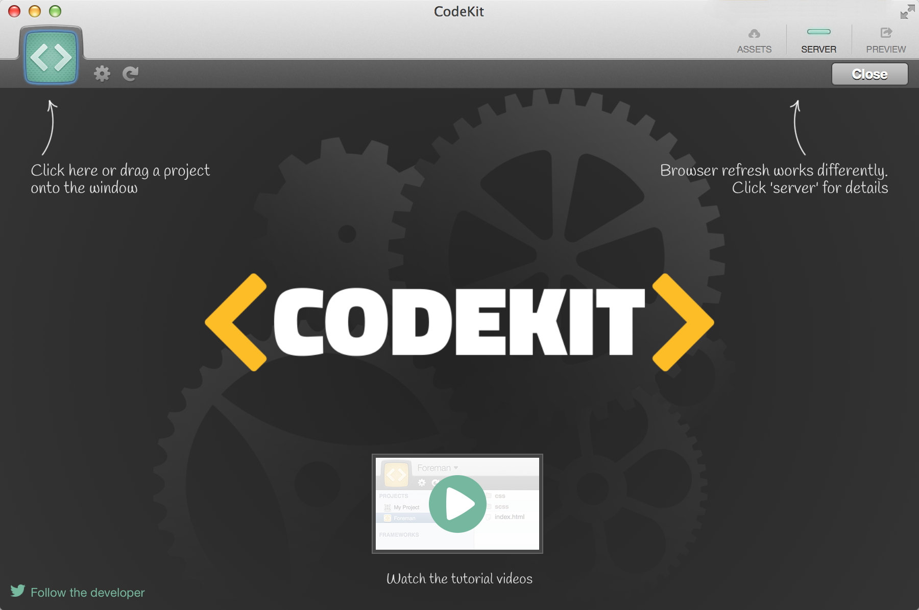
CodeKit
- Graphical interface for compiling into CSS
- Mac only
- Handles Sass and a bunch of other stuff.
CLI
Putting It All Together
Demo Time!
style.css
- Has to exist in the theme root with specific comments
- But doesn't need to be the actual stylesheet
theme-name.scss
- Keep theme source Sass outside the theme directory
- Source files get version controlled
- "Compiled" CSS does not
Wrap Up
When wouldn't you use Sass?
Uh, I dunno.
Every day: It’s just a few styles. I won’t need SASS [sic]. Five minutes later: I really wish I had done this in SASS.
— Yuri Victor ♥ (@yurivictor) June 15, 2014Yell At Me Later
- Twitter @taupecat
- Email tracy@taupecat.com
- Web http://www.taupecat.com/